Admiralty Building branding
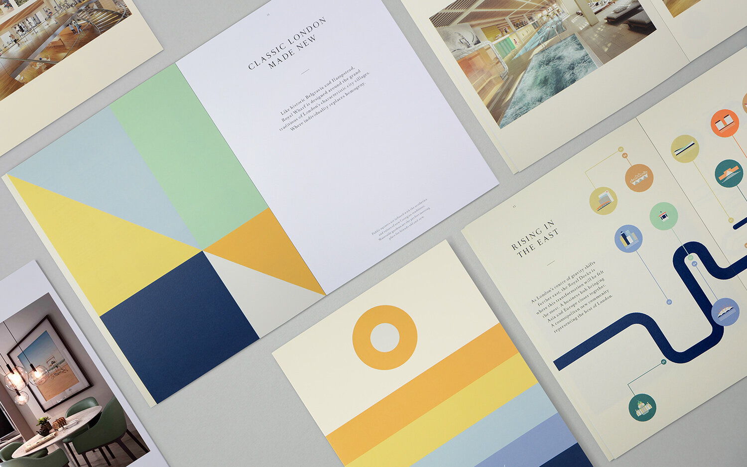
Branding for building development in London’s East End. The design concept was based on a graphic reinterpretation of the admiralty symbol which includes five horizontal lines and a circle. The building is part of a large Royal Wharf development and the new branding had to fit within the existing Royal Wharf design scheme. A major constraint of the project was a lack of imagery, which was resolved using icons and large abstract illustrations derived from the existing Royal Wharf branding. The project was done in collaboration with DPP design studio.
Type of work
Concept
Branding
Design
Illustration
Art direction


Icons design by Carmel Conway

